Update, 26 Oct 2018: And the winner is ...
... the rickshaw cover.
Thank you to everyone who voted. Across Facebook, Gwulo and Twitter there were a total of 200 votes, with 78 for the children cover and 122 for the rickshaw cover.
Whichever photo you preferred, you can take a closer look when you see the book. Both photos are shown there, enlarged as double-page spreads.
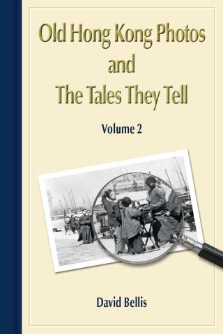
The layout of the new book's cover will be very similar to the first book, but this time using a blue colour instead of red.
I've narrowed down the choice of photograph to these two, and would like your help to decide which one to use. Imagine you see the cover on a shelf in a bookstore, or on a website. Which one are you more likely to pick up to take a closer look?
Please leave a comment below with the word children or rickshaw to vote for your choice. (Or if you're reading this in the newsletter, please vote by reply email.) Here they are ...
'Children' cover:
'Rickshaw' cover:


Comments
children
children
Book 2 Cover
’Rickshaw’ - but probably only because of my name! Only for tourists by the Star Ferry when I lived there!
Book Cover
Children because I think the image is more intriguing.
Rickshaw
The rickshaw photo is more distinctly of Hong Kong, with the ferry terminal and the peak in the background.
Rickshaw
Definitely rickshaw - so iconic of old HK and immediately conjures up a lot of nostalgia, evoking everything one loves about gwulo HK.
Book Cover
Rickshaw
Book 2 cover
Rickshaw, on its own - It's a "cleaner" photo, less cluttered. But then, Book 1 shows someone being carried (similar theme).
Children - will help sell the
Children - will help sell the book in bookstores. The rickshaw is very “master/servant”. I speak as one who is now of that profession - an Uber driver.
cover: Children
Because it's different...there are more books with rickshaws, I think
book cover
Really like the rickshaw picture.
Rickshaw
I feel that the rickshaw photo looks better, it fits well into the magnifying class, whereas the children seem cut off.
Rickshaw Cover
Really think the Rickshaw pics would be the perfect cover
It has my vote
Regards
Barb Mackenzie
Children, the photo itself
Children, the photo itself looks like a story to be told
Cover photo
I would chose the children - mostly because you well illustrated the racial oppression clearly on the first book cover. I Love your work!! Thank you thank you.
children
My favorite is one with children. The rickshaw is too much jumping out of the photo.
Rickshaw
In terms of jacket design, I agree with Kit Lun that you need to go for the less cluttered image that the viewer can immediately identify. There needs to be space around the figures to act like the mount in a picture. Can you not also change the colour of the jacket to say light blue, instead of just the spine? People in a hurry may not realise it's a different book to Vol. 1. It would be good to have an unmissable visual signal that it is.
I vote for the photo with children
The children in the photo and the surrounding activities/environment seem to convey much greater and richer information.
Vol. 2 Book Cover
”Rickshaw”
Go with the kids
As many have already noted, the rickshaw photo is a better cover photo in terms of its composition, etc. However, I would argue that the image of a rickshaw (like photos of a junk against the highrise skyline of HK Island) has become a Hong Kong cliche. The photo of the children is not the best cover photo in terms of how it looks on a cover, but it is also more original and it avoids the inevitable political baggage that comes with any image of a rickshaw driver hauling a passenger who is obviously more wealthy and powerful. I vote for the kids and can't wait to read the book!
That's my 2 cents Hong Kong.
Rickshaw Cover
I prefer the rickshaw cover. The rickshaw image is clear, crisp, and uncluttered. It is also more readily identified as being taken in Hong Kong. Faces are visible on the three people in the foreground. The dual Chinese/British character of Hong Kong is also well represented in this photo. This photo is more likely, in my view, to attract potential buyers of the book.
In contrast, the children cover contains a poor, cluttered image,marred by shadows. Only one of the faces of the people in the foreground is clearly visible. The location of the photo is not readily distinguished from Ghangzhou or some other place in coastal China. For the average person, the text on the book cover is the only thing that suggests the children photo was taken in Hong Kong.
Rickshaw
I love both photos but the 'Richshaw' links well with photo on Volume 1
Neither
The rickshaw photo is better composed - it's clear what I'm looking at. But in terms of meaning, it comes across as imperialist nostalgia.
The children photo is better in terms of subject, but it's a poor photo. I didn't immediately know they were children without your label - they're just dark human shapes clustered together. It doesn't catch my eye at all.
I know this isn't helpful, but hey, it's the comments section!
Rickshaw!!!!
definitely :)
Rickshaw
The rickshaw photo. It's a bit more eye-catching.
New Cover Photograph
Children
Gwulo book cover for volume 2
I vote for the children. For library-goers, their interest retention time is short because ricksaw is well known; and the scene is simplistic. There are more features to generate interest in the children's photo, and naturally I would pause to take a "longer" look at what they were doing, hence higher probability it being picked up. Regards, Peter